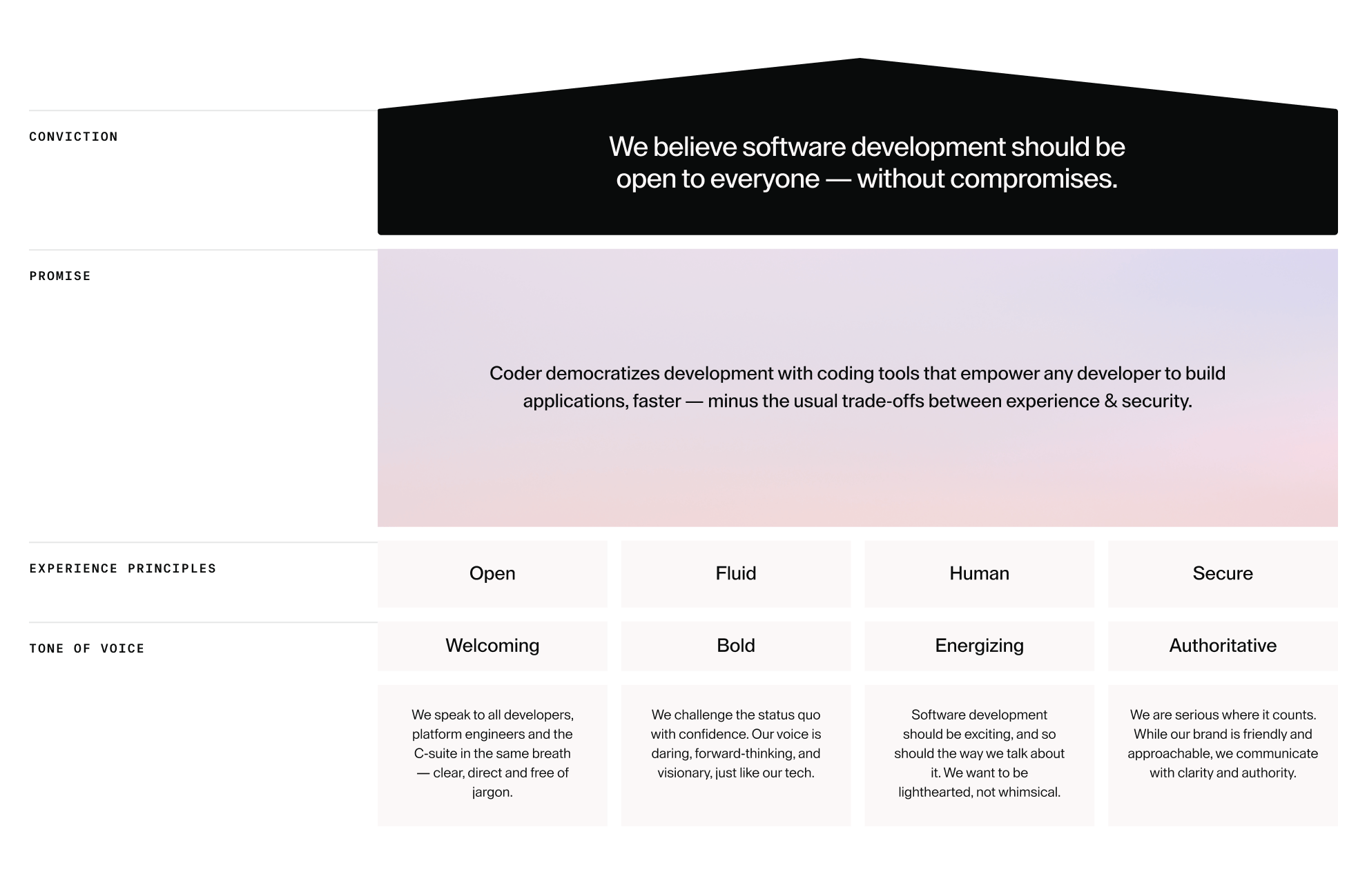
1.1Conviction
We believe software development should be open to everyone — without compromises.
1.2Promise
Our Brand Promise articulates what customers can consistently expect from the brand.
Coder democratizes development with coding tools that empower any developer to build applications, faster — minus the usual trade-offs between experience & security.
1.3Experience Principles
Our Experience Principles are informed by research-based highlights that show where the industry or brand is currently at, and how we want to implement change to stand out and grow — informing how we look and how we feel.
Open
We believe development should be accessible to everyone. That means a brand that feels inviting, inclusive, and transparent: designed for builders, tinkerers & enterprises alike.
Fluid
Innovation doesn’t stand still, and neither do we. Coder evolves alongside developers, enterprises & technology itself — adapting and never getting in the way.
Human
Developers are the heartbeat of Coder. Every interaction should feel frictionless and empowering, giving them autonomy, speed & joy so they can focus on what they do best.
Secure
Serious software for serious teams. Coder combines enterprise-grade security and governance with a developer-first experience (proving that control and creativity can actually coexist).
1.4Brand House
Our Brand House brings together all our strategic components and crystallises what really matters about our brand and business.
Coder is an AI software development company leading the future of autonomous coding. Coder helps teams build fast, stay secure, and scale with control by combining AI coding agents and human developers in one trusted workspace. Coder’s award-winning self-hosted Cloud Development Environment (CDE) gives enterprises the power to govern, audit, and accelerate software development without trade-offs. Learn more at coder.com.
2.2Voice Characteristics
Our tone of voice characteristics align with our conviction, promise and experience principles. We should keep these front of mind when creating any written content.
Welcoming
We speak to all developers, platform engineers and the C-suite in the same breath — clear, direct and free of jargon.
Bold
We challenge the status quo with confidence. Our voice is daring, forward-thinking, and visionary, just like our tech.
Energizing
Software development should be exciting, and so should the way we talk about it. We want to be lighthearted, but not whimsical.
Authoritative
We are serious where it counts. While our brand is friendly and approachable, we communicate with clarity and authority.
2.3Linguistic Techniques
Isocolon
Isocolon is a rhetorical device that uses parallel phrasing — lines or clauses that match in length, rhythm, and grammatical form. Many key Coder messages are built on balanced, rhythmic pairings or trios.
HOW WE USE IT
Code with clarity.
Scale with certainty.
WHY IT MATTERS
Welcoming
The rhythm feels natural and approachable, making even complex ideas easy to digest.
Bold
Parallelism creates statements that sound confident and memorable.
Energizing
The pace and structure carry energy and momentum — perfect for forward-looking, dev-first messaging.
Authoritative
Balanced structure conveys precision and control, reinforcing Coder’s technical credibility.
Syntactical Ellipsis
Ellipsis is when you deliberately leave out words because they’re understood in context — making the sentence tighter, punchier, and more dynamic. Subjects and verbs are often implied rather than spelled out ("Build fast" instead of "You can build fast").
HOW WE USE IT
Spin up at speed.
Control at scale.
WHY IT MATTERS
Welcoming
Short, clear commands or promises make the experience feel frictionless and user-first.
Bold
Cuts out unnecessary words, leaving only the powerful ideas.
Energizing
The tightness creates a sense of speed, action, and flow — essential for a developer audience.
Authoritative
Stripping down sentences shows confidence — Coder doesn’t need to over-explain or hedge.
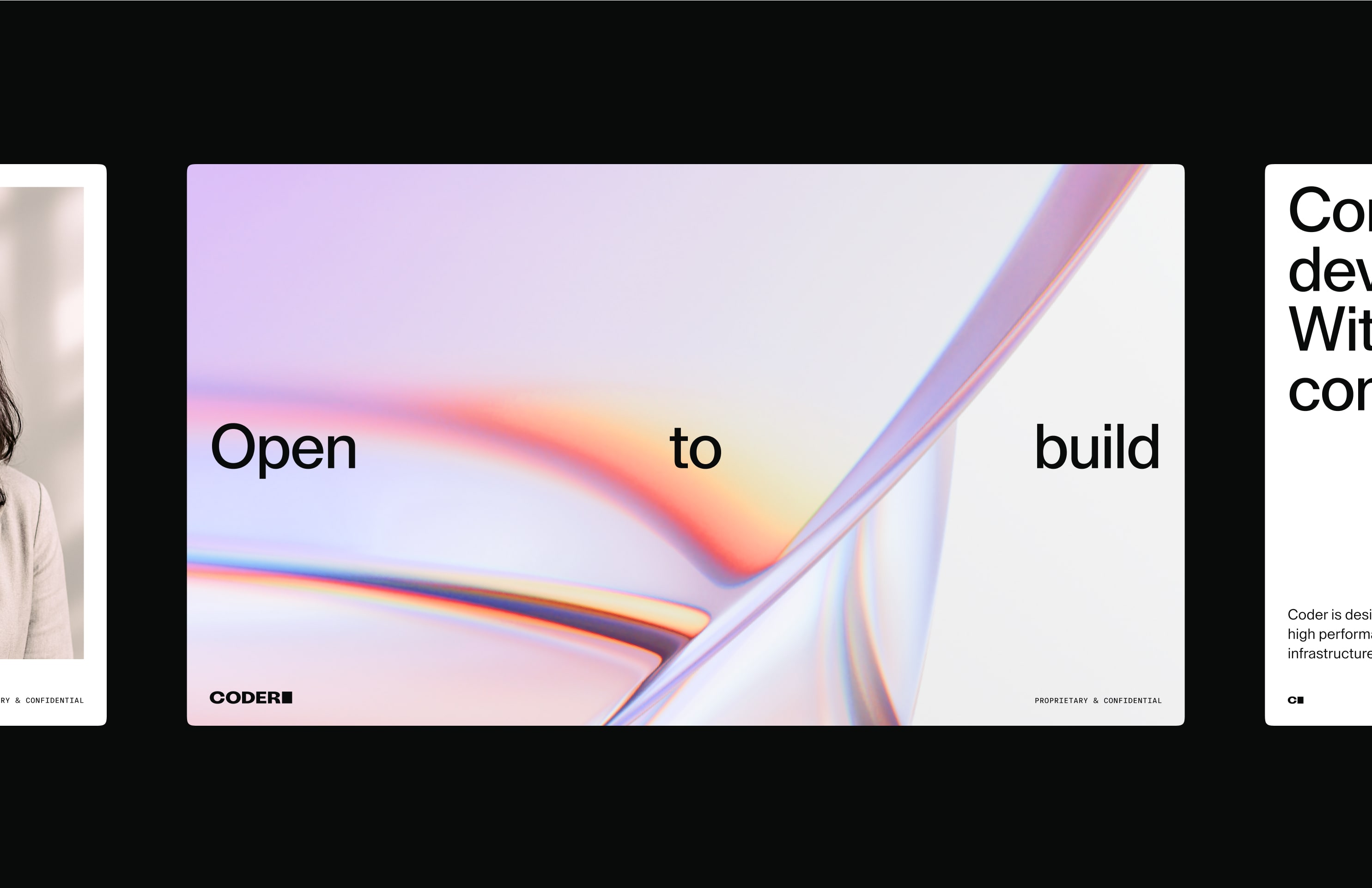
2.4Messaging Framework
Our messaging framework distils how we express Coder’s value at every level — from big-picture brand belief to functional proof — using language that reflects our ToV.
Vision / ethos
Inspires belief in the brand’s mission
Open to build.
Whether you're scaling a platform team or shipping side projects, Coder puts the power to build in your hands.
What
Clear product value proposition
Coding tools, without the trade-offs.
Finally, cloud development that doesn’t force you to choose between enterprise security and an experience your developers will love.
How
Functional differentiator
Spin up at speed. Control at scale.
Self-hosted, centrally managed, and optimised for speed — so you can ship fast, stay secure, and be in control.
Why
Outcome and emotional reward
Develop anywhere. Deploy everywhere.
Where code comes together — on your terms, in your environment, at your speed.
2.5Key Messages
Our key messages communicate the key capabilities, differentiators and values of our company. The way we express them helps to make our messages more memorable and unique to our brand.
vision / ethos: brand-level messaging
What: core value proposition

how: supporting features & enablers
why: emotional or strategic outcomes

2.6Style & Mechanics
These rules lay the foundations for our brand voice and should be maintained at all times to ensure consistency and professionalism.
Lead with clarity
Example: Spin up and start building.
Why: Say the most important thing first — our audience moves fast.
Cut the filler
Example: Build fast. Own fully.
Why: Use syntactical ellipsis — skip what’s implied. Trust the reader.
Speak like a human
Example: You own your workspace. We just make it seamless.
Why: Favor direct, natural tone over technical jargon.
Ground the promise in benefit
Example: More productive, from day one.
Why: Show how the product makes life better — quickly.
Write with energy
Example: Push code, not config.
Why: Choose verbs with intent. Keep pace high and messages punchy.
Use confident, rhythmic structure
Example: Developer-first. Agent-ready. Secure, always.
Why: Parallel phrasing (isocolon) sounds decisive and polished.
Over-explain
Example: Coder is a platform that enables cloud-based development environments across a range of use cases.
Why: Too slow and corporate. Say what it does, not how it works.
Say everything at once
Example: A secure, flexible, scalable, portable, open-source, self-hosted, dev-first platform.
Why: Prioritize the message. Say one strong thing at a time.
Get fluffy
Example: Unlock the power of limitless innovation.
Why: Avoid abstract fluff — speak like an engineer who cares.
Overuse jargon
Example: Persistent, containerized virtualized dev shells…
Why: Devs know this stuff — but prefer clear, purposeful language.
Lose momentum in long sentences
Example: By enabling configuration flexibility across cloud-native environments, Coder lets you…
Why: Break it up. Every sentence should drive attention forward.
Hedge or pad
Example: You might find this useful...
Why: Be bold. No need to soften or second-guess.
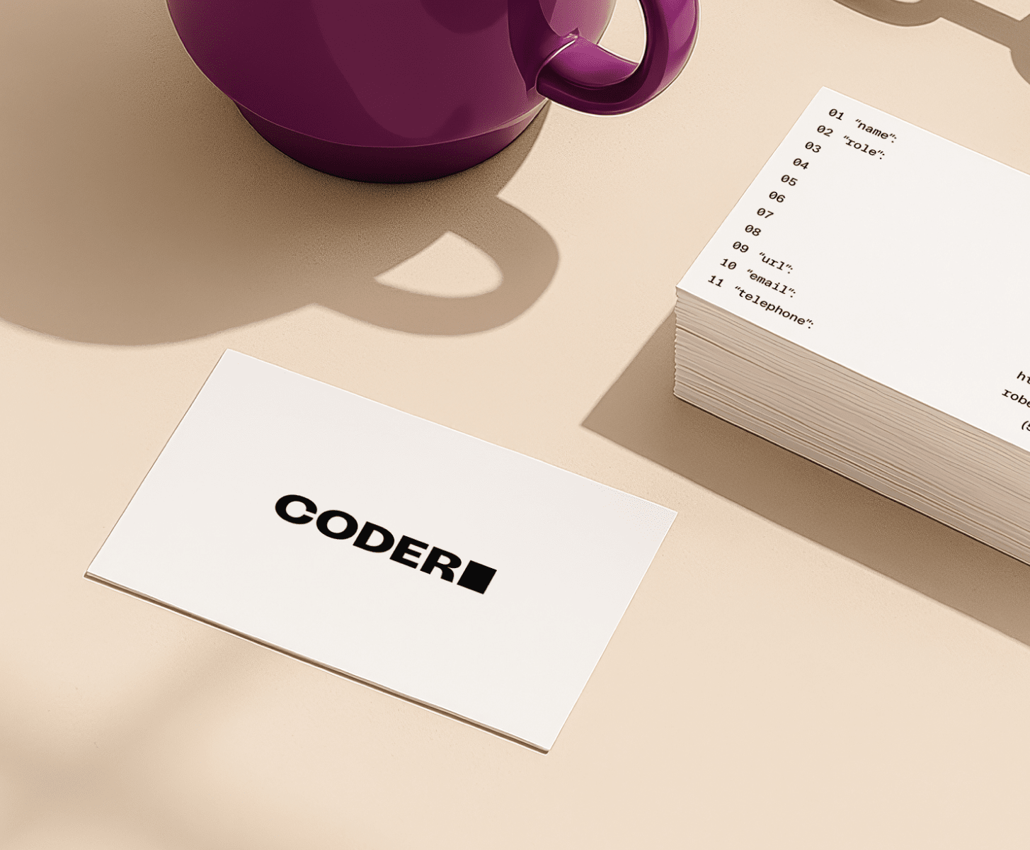
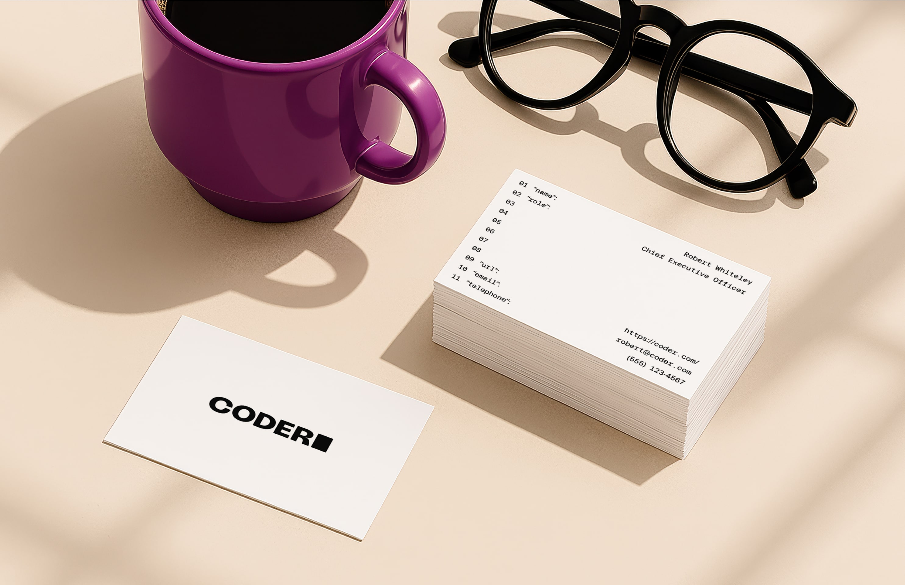
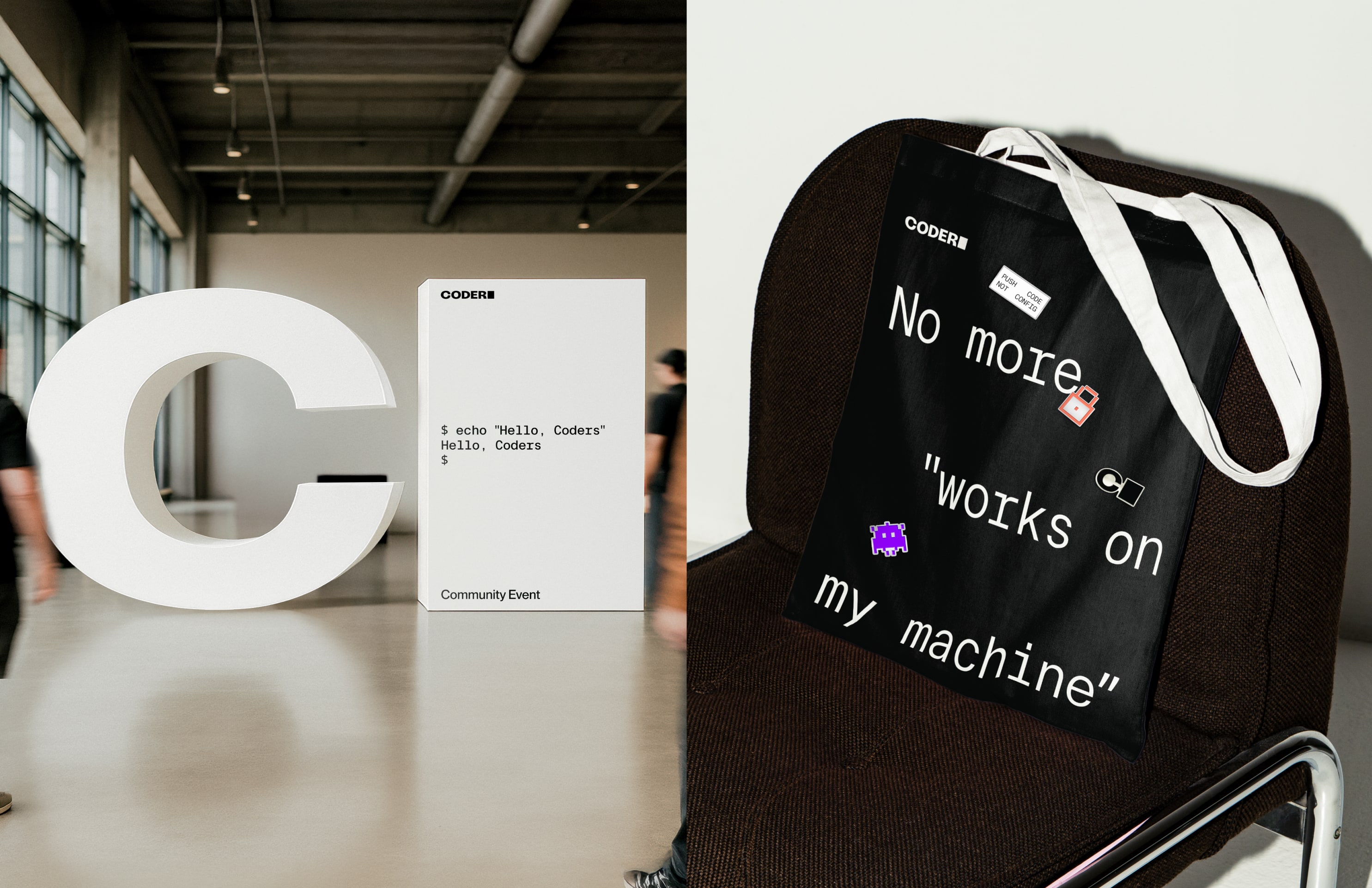
3.1Logos
The Coder logo is one of our most recognizable assets — used across all our brand touchpoints for a unified experience. We use our primary logo in most cases. But if we’re restricted by sizing limitations (such as the website favicon our social avatars), we use our shorthand logo — which carries the same aesthetic and sentiment as our primary logo.
Primary logo
Shorthand logo
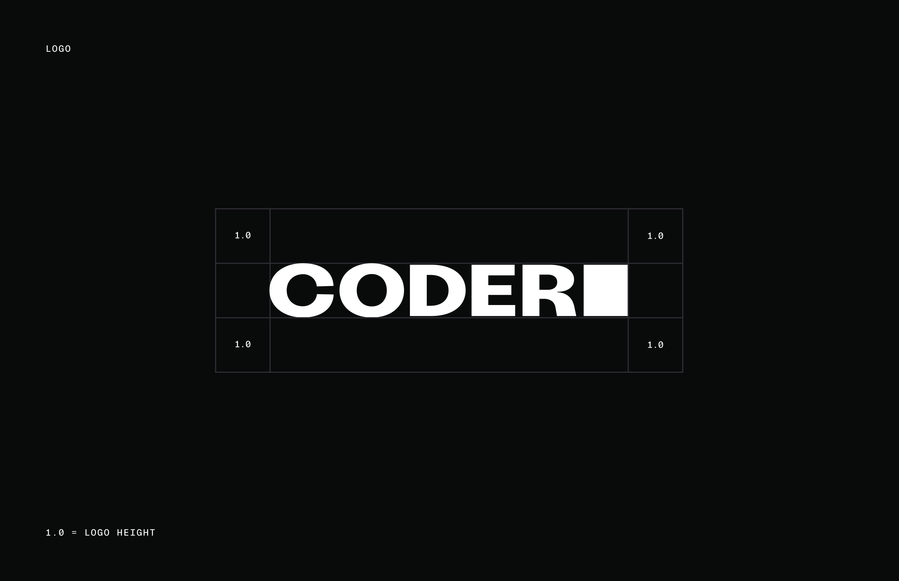
3.2Clear Space
Our logo works best when it has space to breathe, utilising vast open spaces. Our minimum clear space is defined by the height of our logo. However, when using our shorthand logo, we use half of the height of our logo to define the clear space.
3.3Color Application
When it comes to color, we like to keep things simple. We only use White or Black version of our logo. Make sure to check out the Color section of our guidelines for all color values.
Black white background
White black background
Black Image background
White Image background
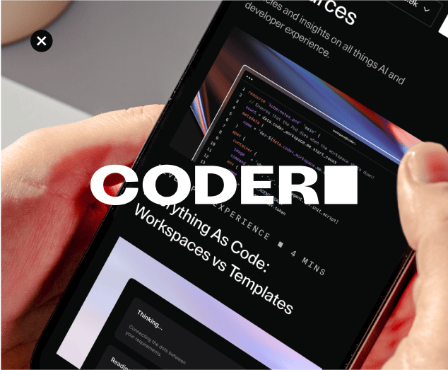
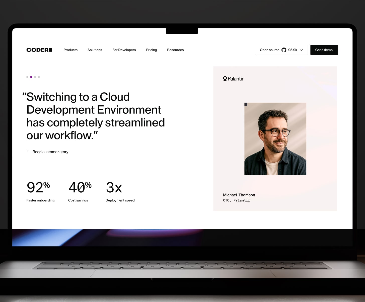
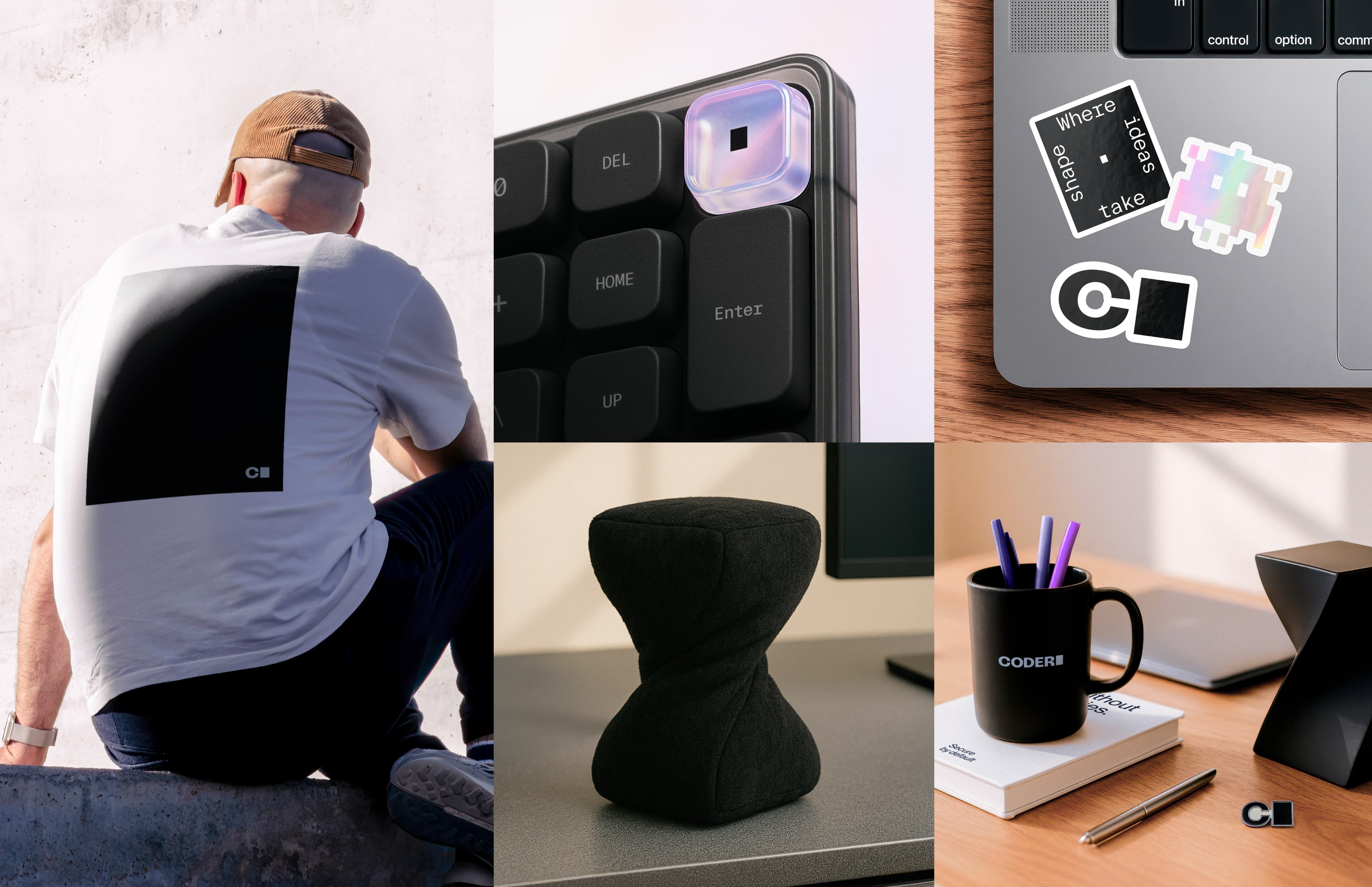
3.4Usage
Web
Socials
Product
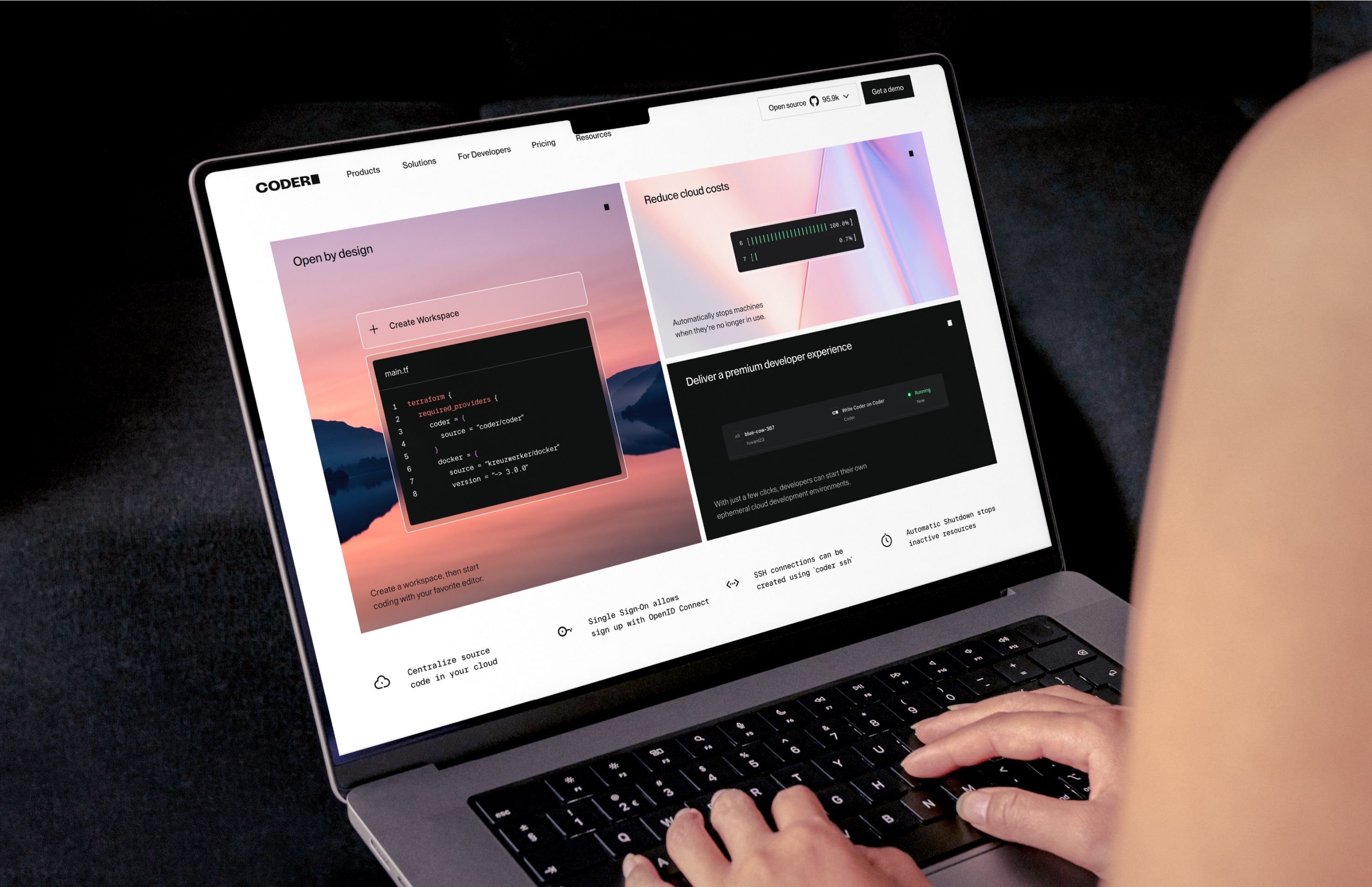
Marketing
3.5Motion
Our logo works best in motion. Rooted in the world of programming, our logo animation symbolizes our ready-to-code environments and signals what’s yet to come.
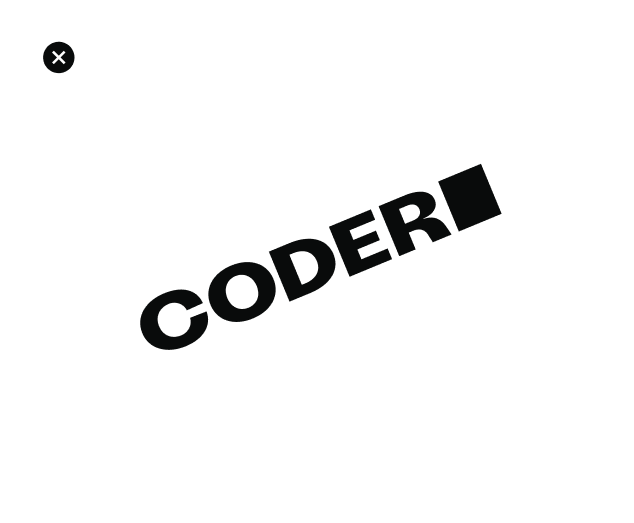
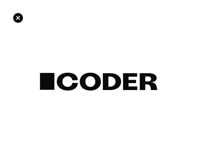
3.6Misuse
It’s important that our logo is consistent and legible at all times. Try to avoid some of these common misuse examples when using our logo.
Avoid stretching the logo
Avoid positioning the logo on an angle
Avoid recreating the logo lockup
Avoid using non-approved logo colors
Avoid placing the logo over busy imagery
Avoid using gradients or other effects
4.1Blink
Charming and characterful, our unassuming brand brand device, Blink, lives within our logo as the block cursor. Blink drives the entire Coder experience, injecting emotion and personality into every touchpoint to unlock the unlimited potential of Coders all around the world.
4.2Idents
With a range of expressions, Blink’s playful movements demonstrate the joy of building, and reflect everything from moments of transition to moments of success.
4.3Idents Usage
Logo
Product Moments
Notifications
Emojis
4.4Behaviours
While Blink’s expressions are often charismatic and playful, it also has a series of functional behaviours that help us build brand attribution across all our marketing material — whether static or in motion.
Typing messages
typing code
Opening windows
Focusing
zooming
highlighting line items
Visual Language
5.1Overview
While Blink is often seen as a simple 2D block cursor, we also have moments of transition into the world of 3D space, creating glass-like textures that symbolize the clarity and openness that our products enable.
5.2Cropping
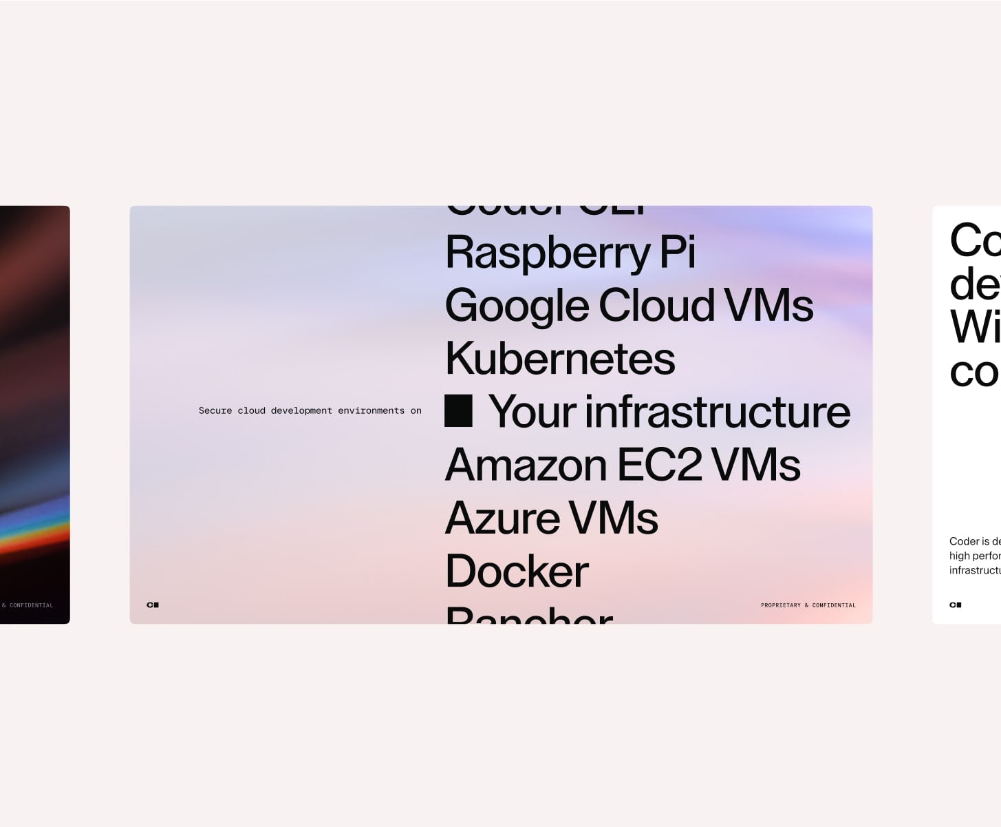
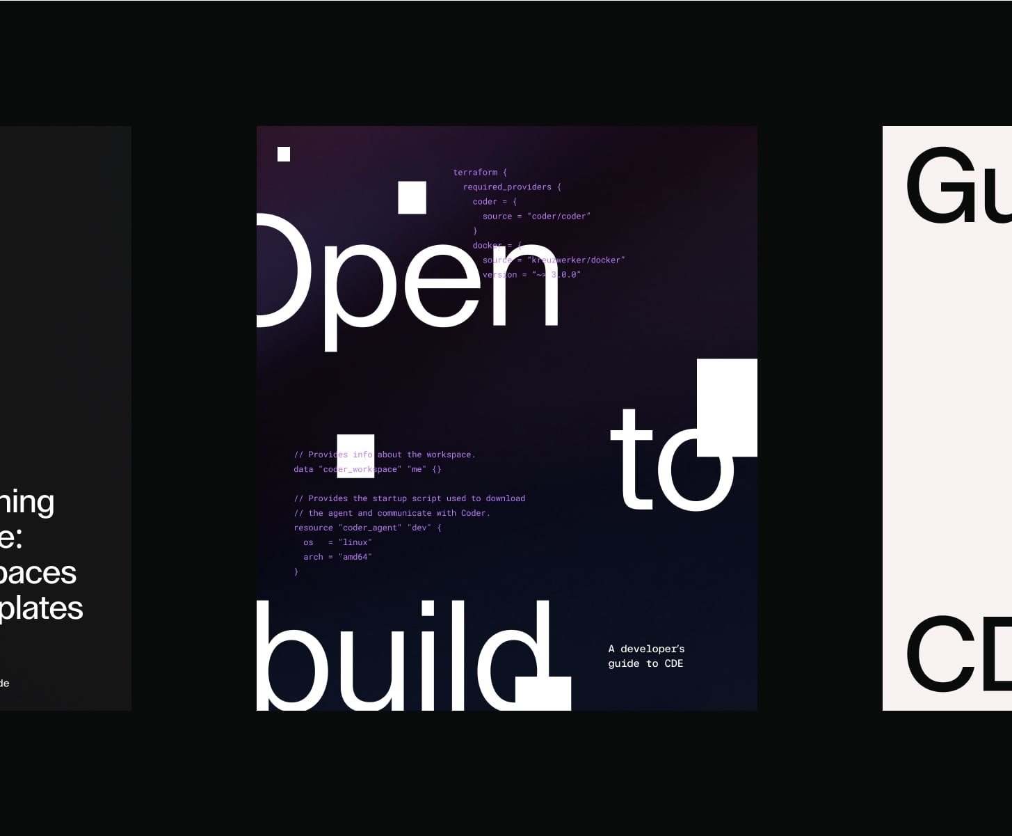
We use a variety of angles and crops in both light and dark mode to create a flexible visual system. While both modes are used across audiences, dark mode is primarily aimed at developers, and light mode at enterprise leaders. This isn’t a strict rule, rather a guiding principle. Aim for an 80/20 usage split in favor of the intended audience for each mode.
Partial crop (light)

full crop (light)

partial crop (dark)

full crop (dark)

5.3Surface Reflections
When we want to be a little more subtle, we can use surface reflections from our supergraphic, allowing us to dial down our visual expression as and when we need to.


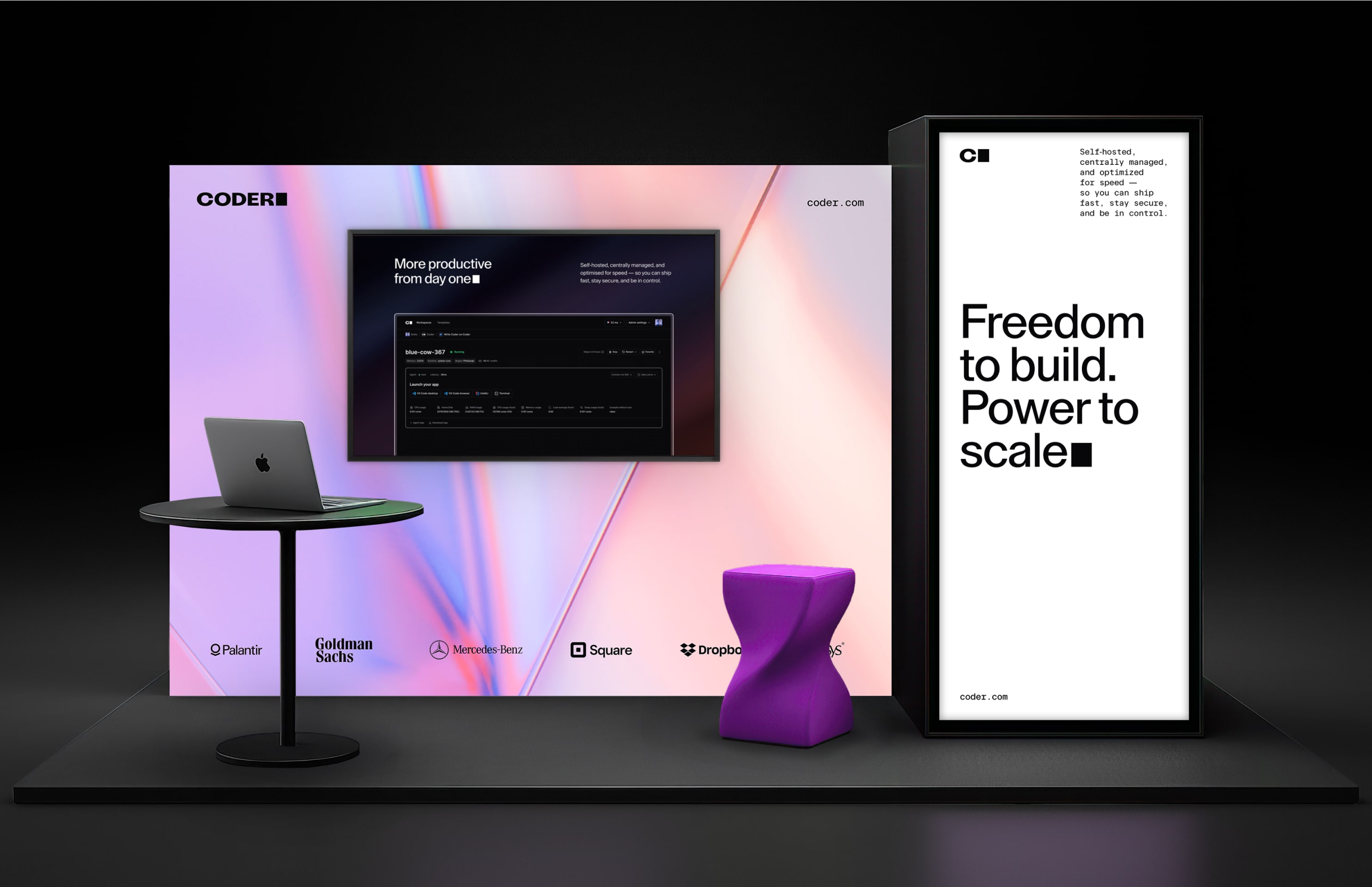
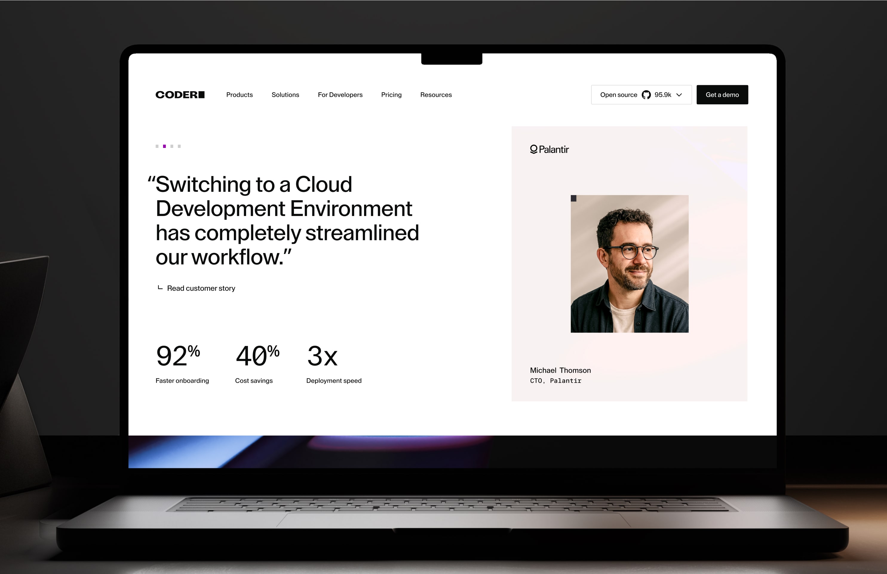
5.4Usage
ENTERPRISE FOCUS - WEB
ENTERPRISE FOCUS - presentations
ENTERPRISE FOCUS - advertising
ENTERPRISE FOCUS - COVERS
DEVELOPER FOCUS - covers
DEVELOPER FOCUS - WEB
DEVELOPER FOCUS - web
DEVELOPER FOCUS - covers
6.1Primary Color Palette
White
Black
6.2Secondary Color Palette
Magenta
Purple
Ember
Orchid
Violet
Sunset
6.3Tertiary Color Palette
Haze
Glacier
Sky
Twilight
Marine
Jade
6.4Neutrals
Shell
Linen
Cinder
Smoke
7.1Primary Typeface
Our primary typeface, Lay Grotesk, allows us to build simplicity and clarity into our identity, and visually reflects our tone of voice. We use Stylistic set 2 of Lay Grotesk for all headings and Stylistic set 1 for all body copy. Stylistic sets can be found in the type settings menu of Figma and all Adobe programmes.
7.2Secondary Typeface
To create a balance between our brand’s emotive character, we use FT System Mono for all labels, technical details and eyebrow headings. We can also use our Secondary Typeface in code terminals and for more technical-looking decorative purposes.
7.3Google Alternatives
When our primary and secondary typefaces aren’t available, we can use our system fonts for our headings, sub-headings and body copy. This includes platforms like Google Slides, shared documents, or other environments where embedding licensed fonts is not possible. We use these with the same rules as our brand typefaces.
Photography
8.1Portraiture
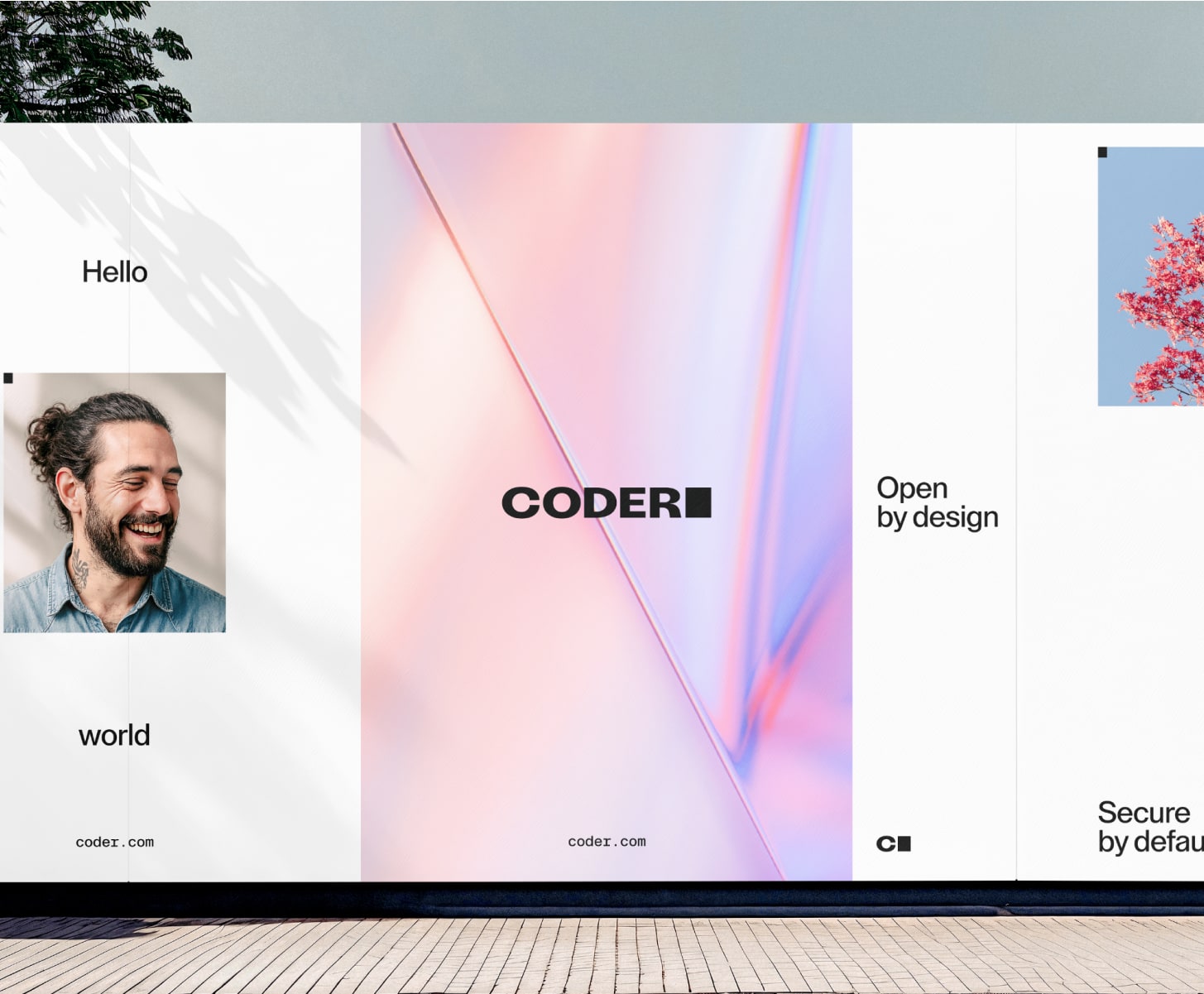
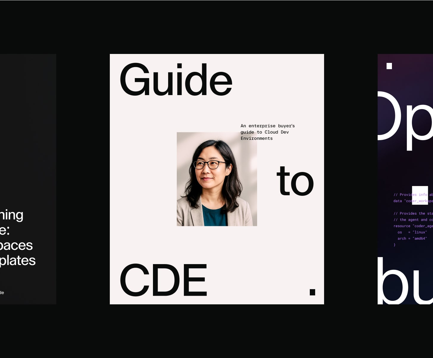
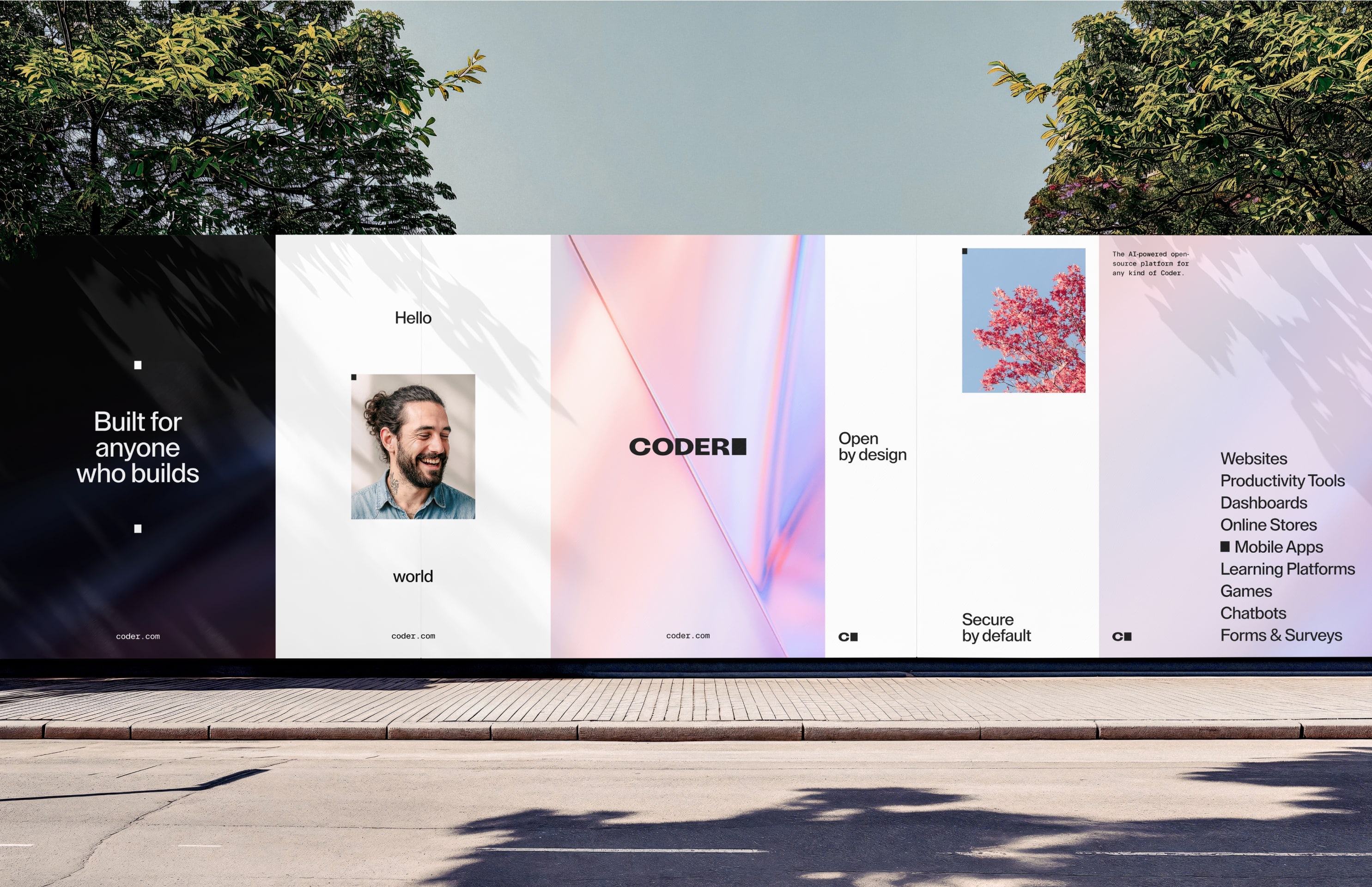
From imagery to ads, our portraiture captures the essence of clarity, openness, and empowerment through the lens of our customers. Photography should feel light, warm and optimistic showcasing genuine human emotion and capturing the lives of all kinds of Coders. This collection of images sets the benchmark for Aria’s art direction and photographic style.


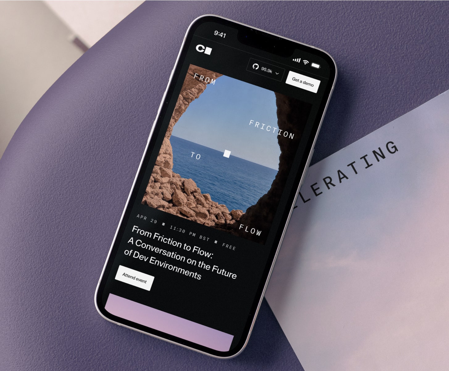
8.2Nature
We also utilise imagery that captures vast open spaces from the natural world that conveys the freedom to build.
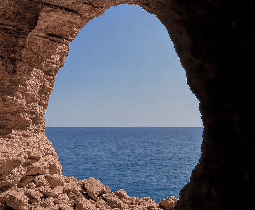

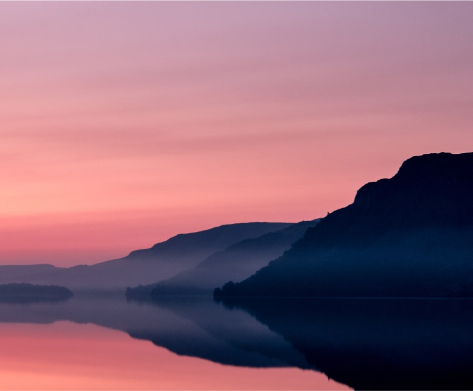

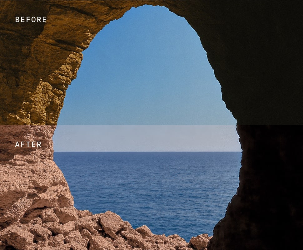
8.3Color Grading
Our color grading enhances imagery by bringing in warmth and richness, creating a sense of optimism and approachability. The subtle adjustments elevate natural tones, adding depth and vibrancy to the visuals.

Iconography
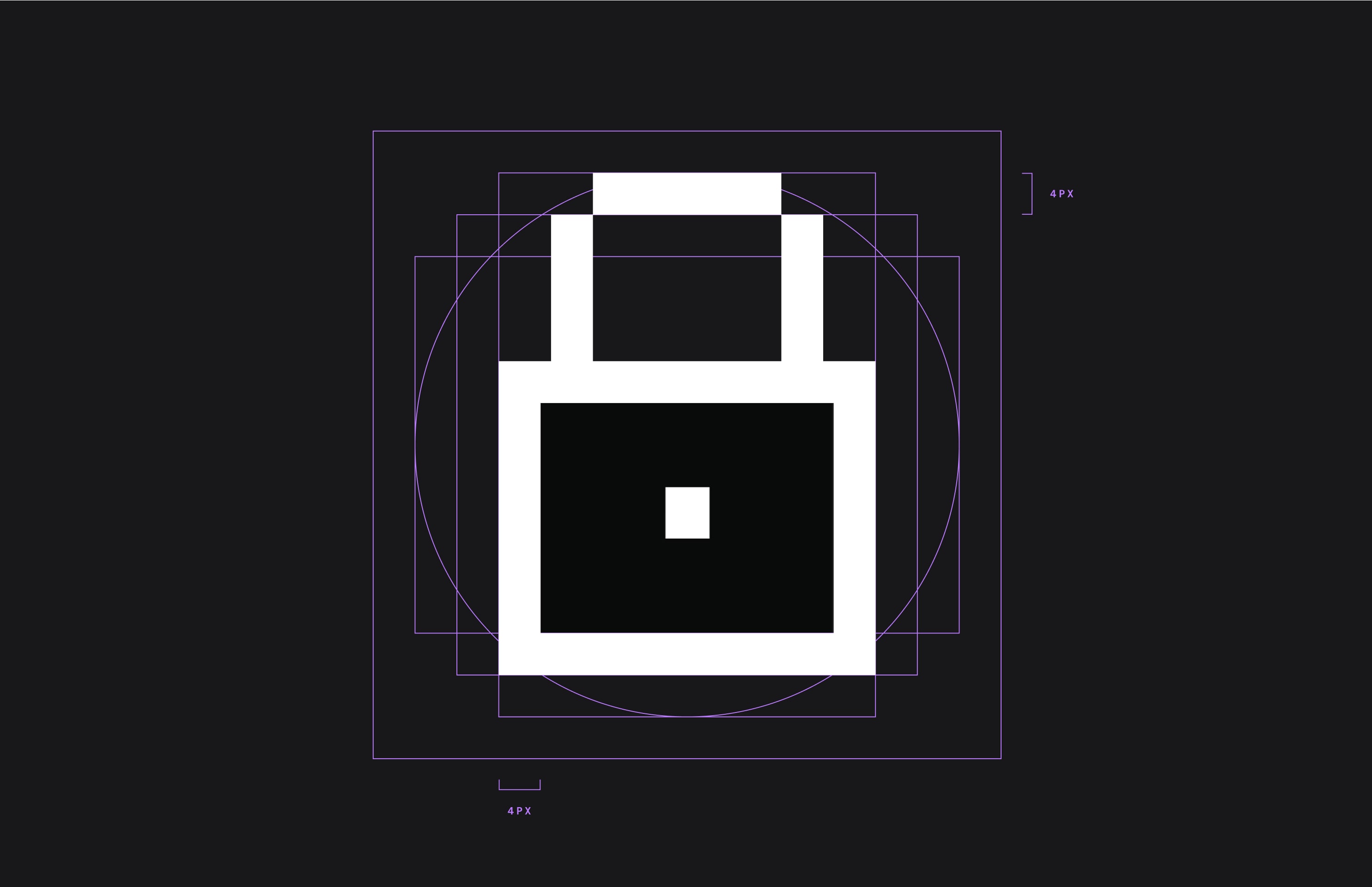
9.1Grid
Our iconography supports our written messaging. We often use icons to emphasise product features and benefits. Icons are created on a 30px x 30px grid as a foundation.
9.2Style
We have created a number of icons for use across our website and other marketing material — all following the same style and aesthetic to create a consistent suite of icons that are unique to Coder.
Brand Application
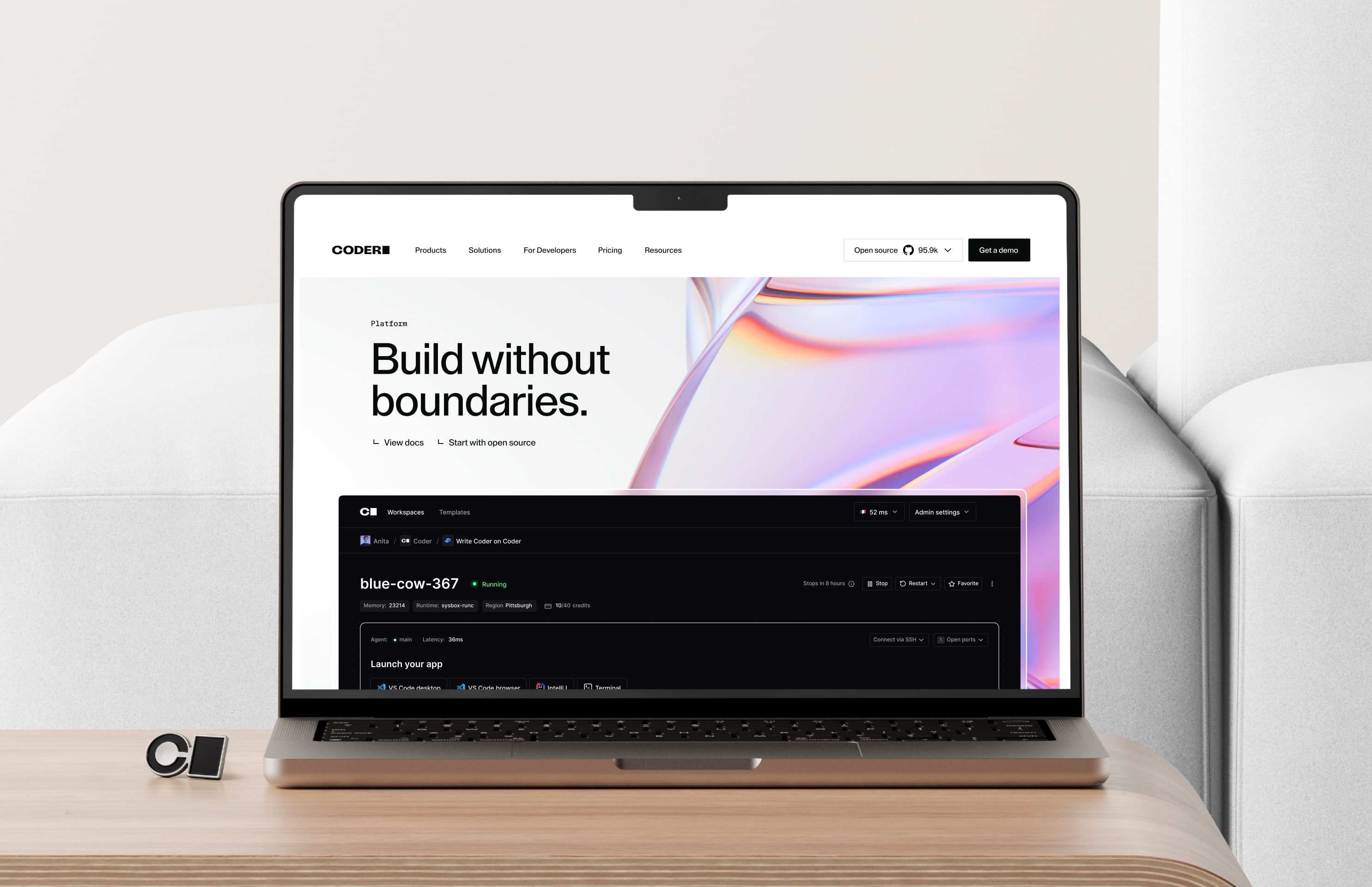
10.1Brand for enterprise
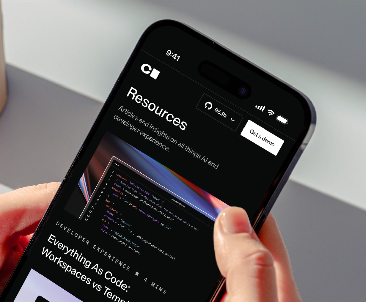
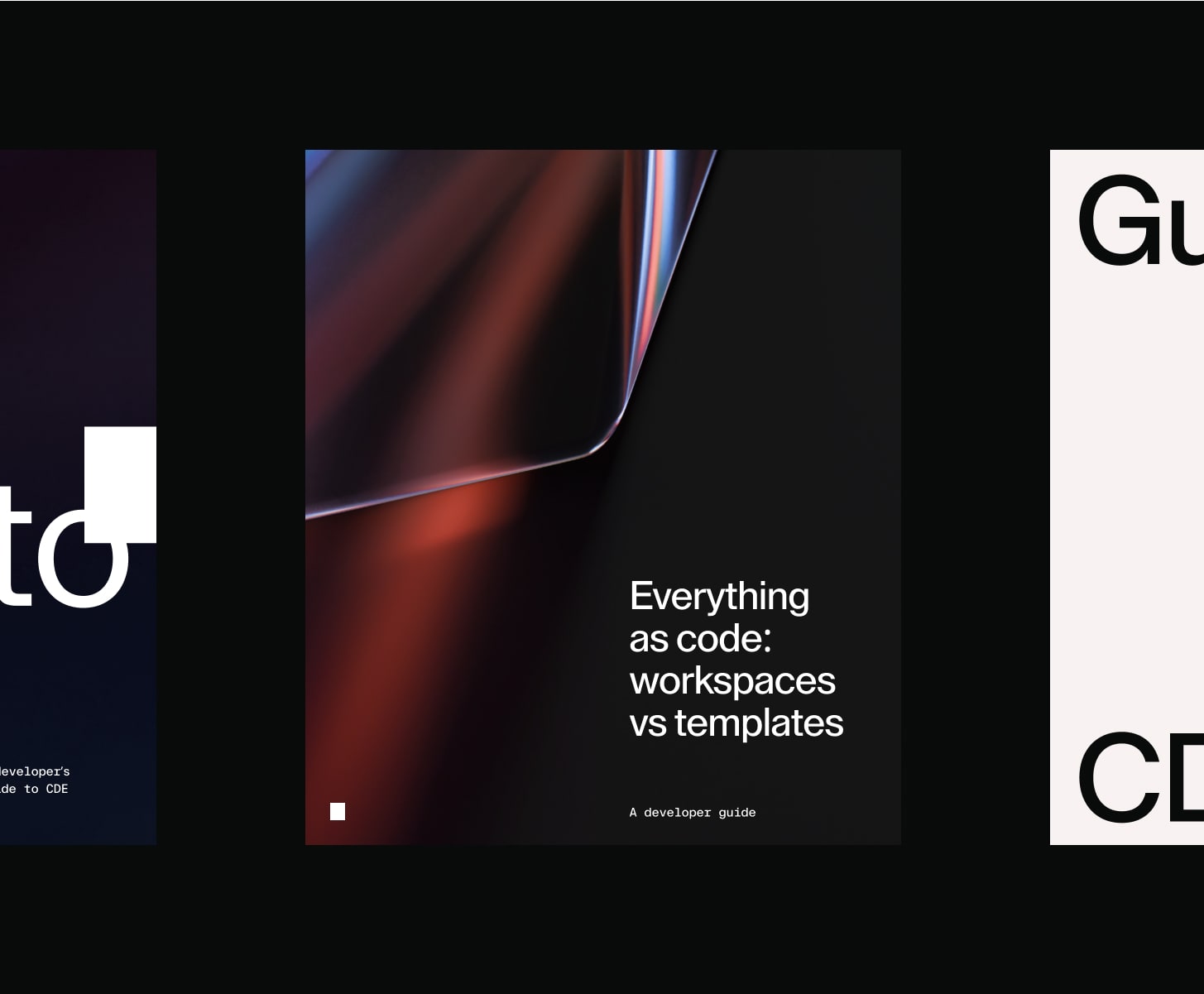
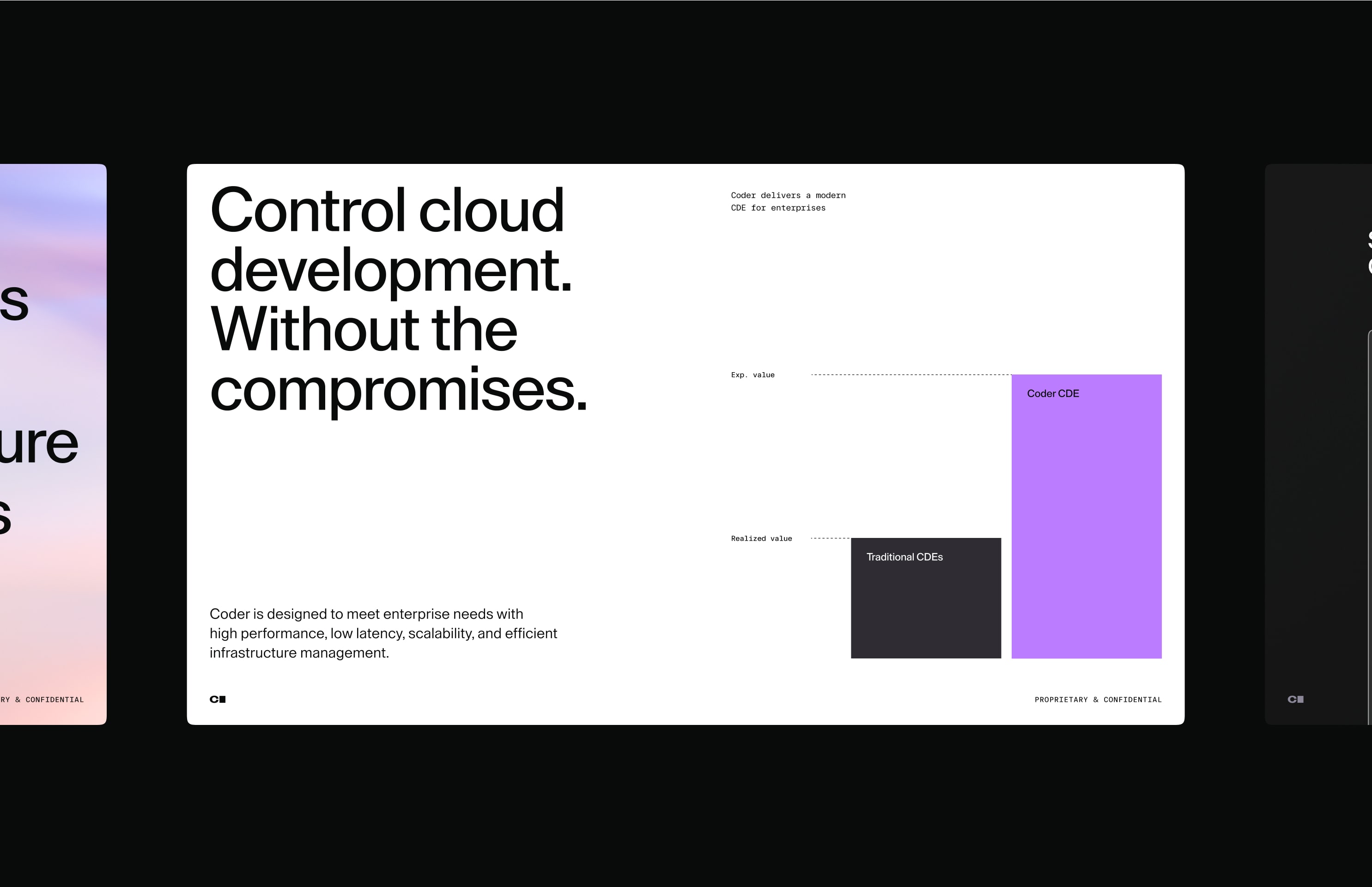
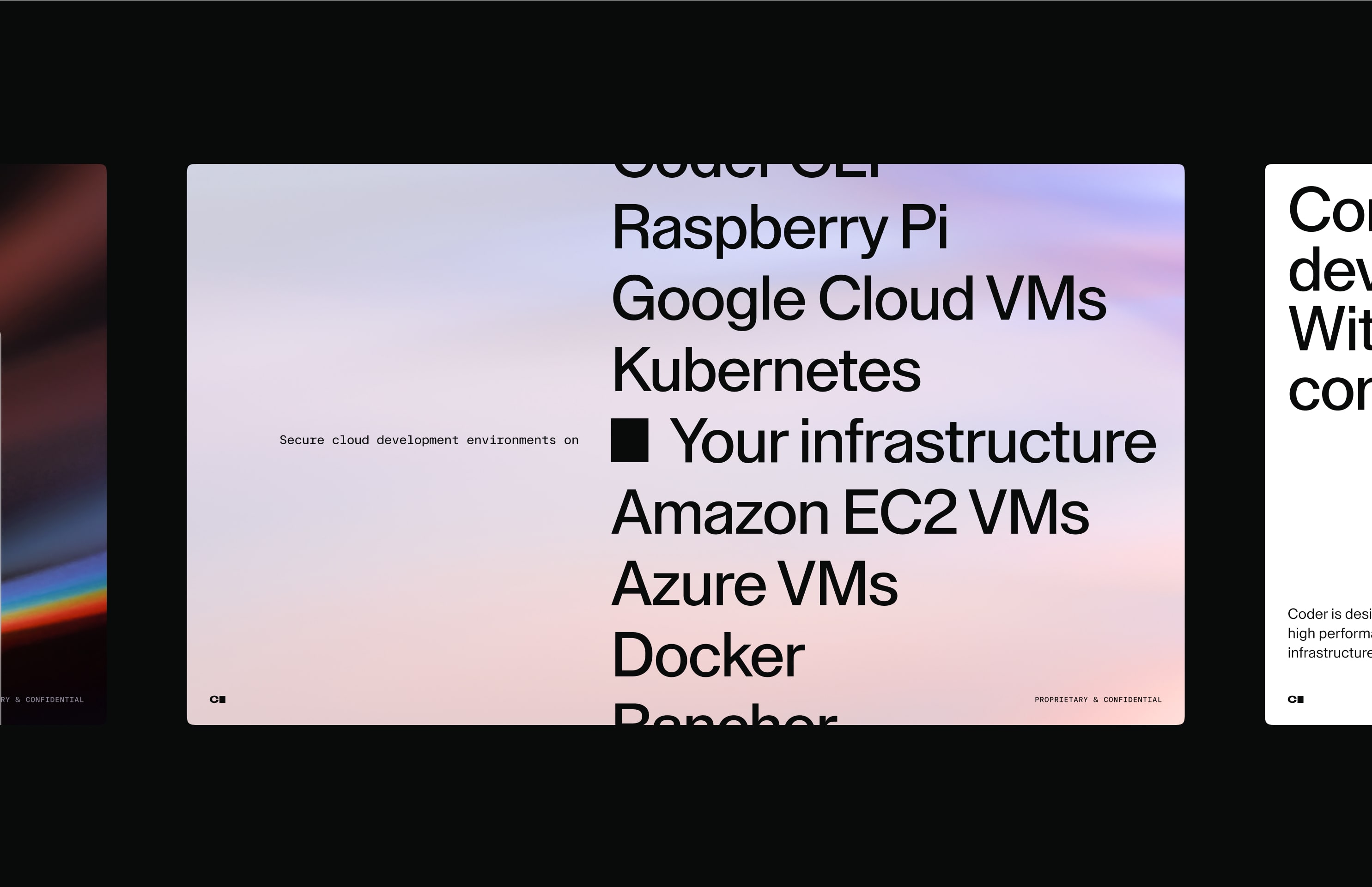
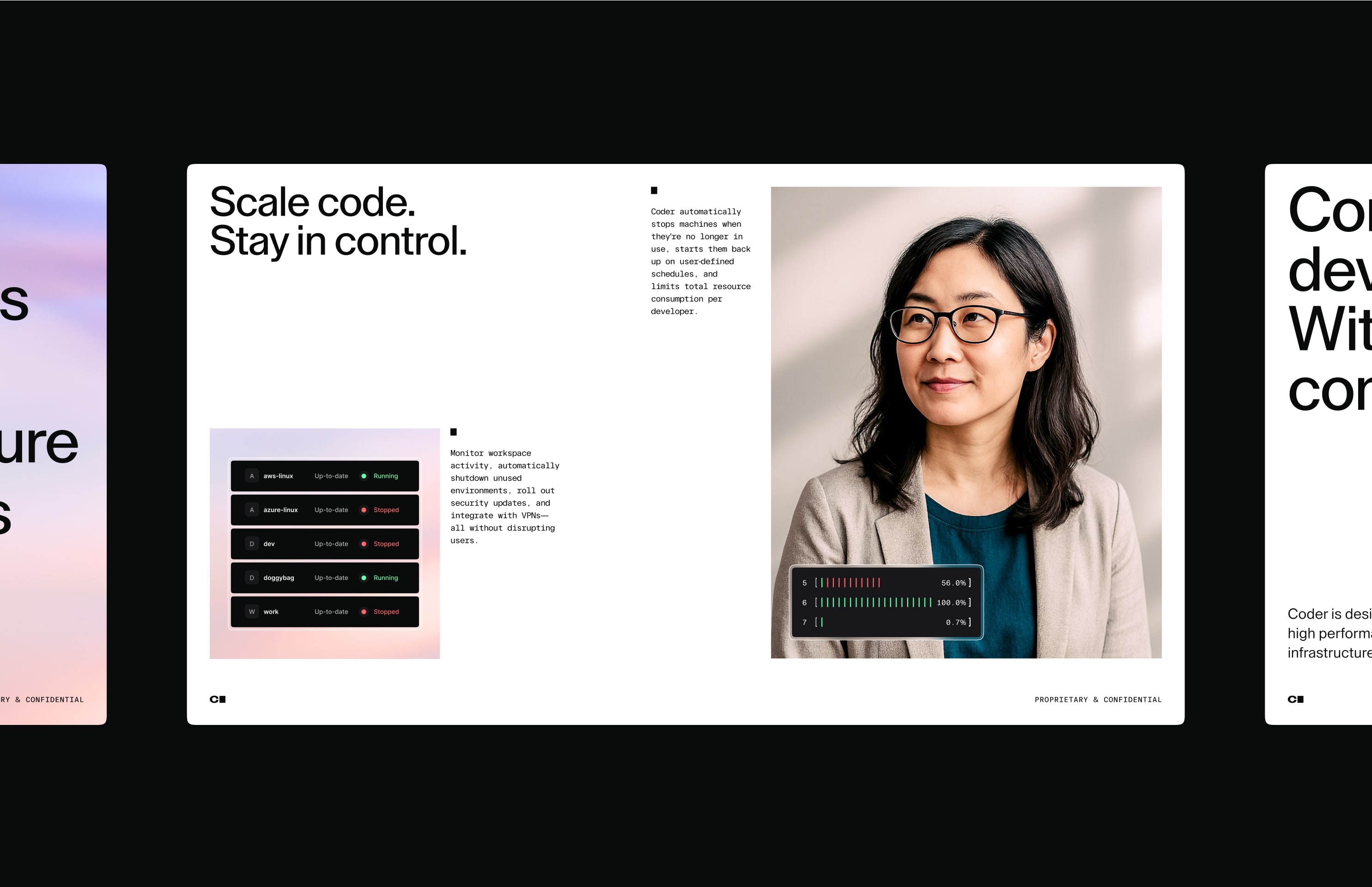
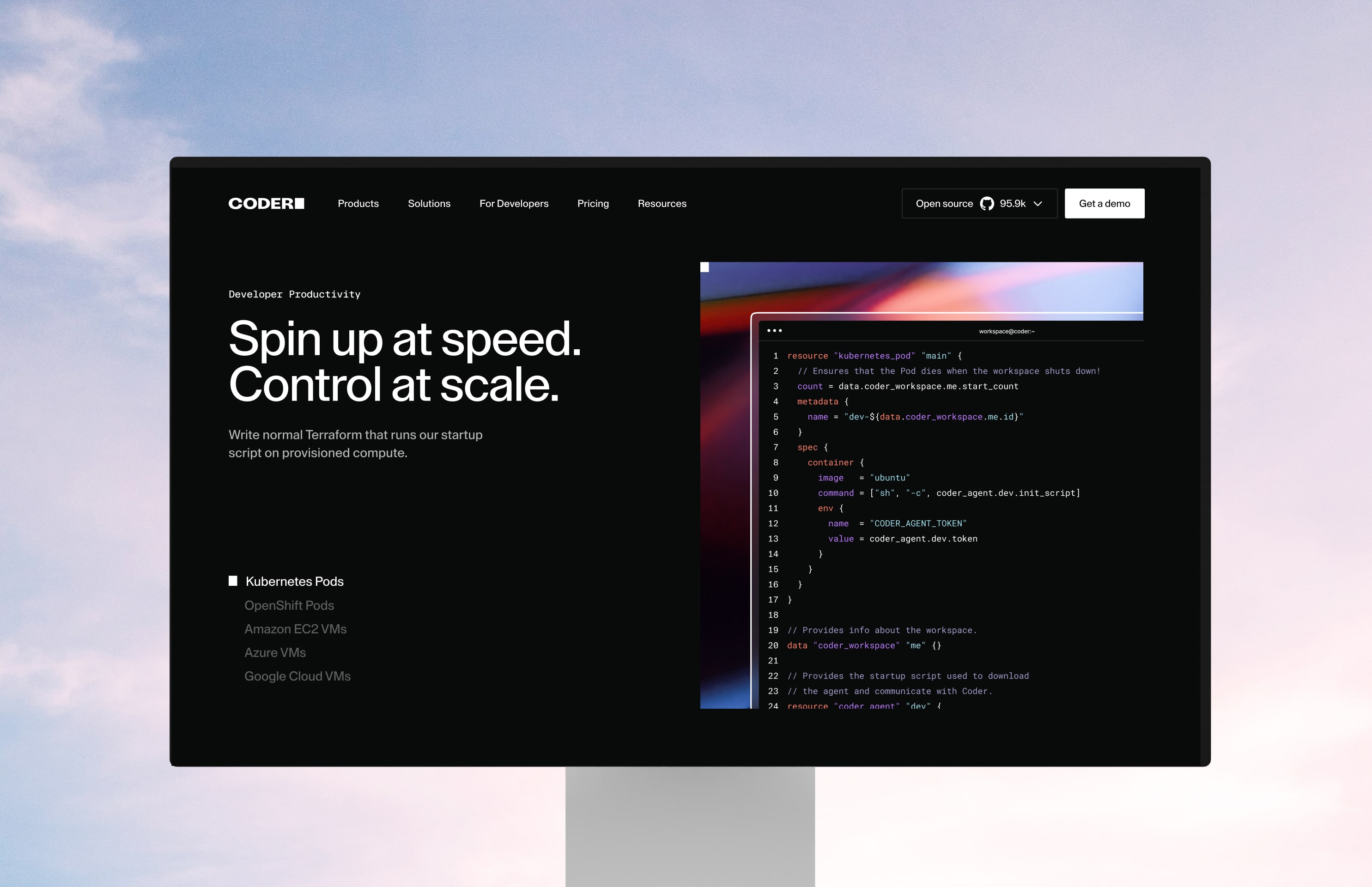
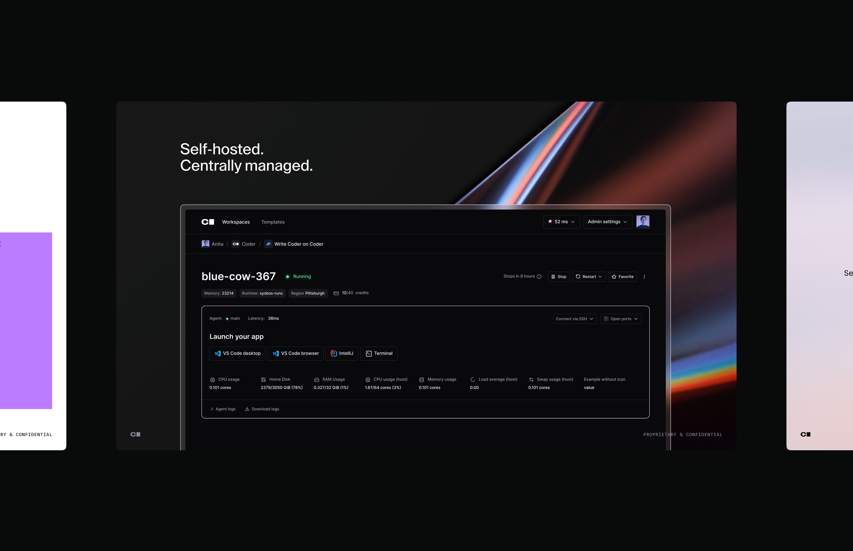
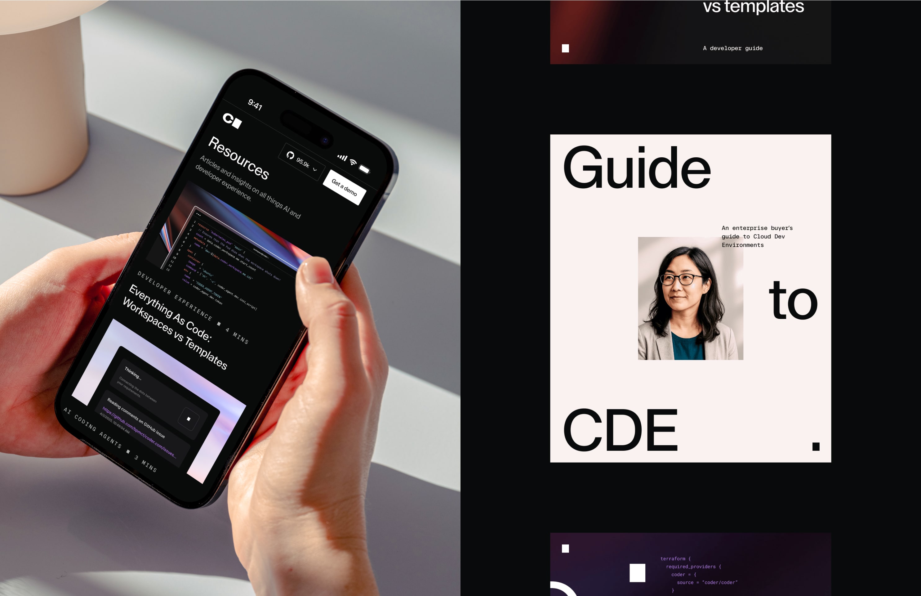
Our brand uses both dark and light modes to create a flexible, consistent visual system. Dark mode reflects a developer-focused aesthetic, while light mode aligns more with the expectations of enterprise leaders. Though both modes can be used across audiences, we follow an 80/20 split as a general guideline, not a strict rule.
10.2Brand for developers
© 2026 Brand Guidelines
Made Together